The Road More Travelled
Back there a ways, two roads diverged. Maybe the one less-travelled would have been a better idea.

"The more we invest with foresight, the less we will regret in hindsight."1 That was Mark Carney in 2018, before all the fires and the smoke and the heatwaves that killed people. In hindsight, he was right.
Inside a busy modern civilization, most of us earnestly make the best choices we can. But almost always, those choices treat the environment as an externality: as long as shareholder profits are healthy, the social networks are interesting, and the AIs are clever and diverting ... well, that's success. Except, in hindsight, perhaps not ... or perhaps not wholly success. The environment contains us: any attempted definition of success that treats the environment as "external" is eventually wrong.
This article contains two visual indicators of climate change that can help us internalize environmental impacts. We know you have probably seen something like them before, but keeping them in view as we make choices — corporate, institutional, and personal — is part of a very necessary safeguard against planetary-scale, regret-filled hindsight ... a safeguard against ignoring climate as an externality.
The measurements are most effective when presented together. In the first, we see how annual fossil fuel emissions are climbing almost every year. In the second, we see how the emitted carbon dioxide sticks around, how it accumulates in the atmosphere. Every year, the tap is opened just a bit more, even while the tub is filling up.
Annual fossil fuel carbon dioxide emissions
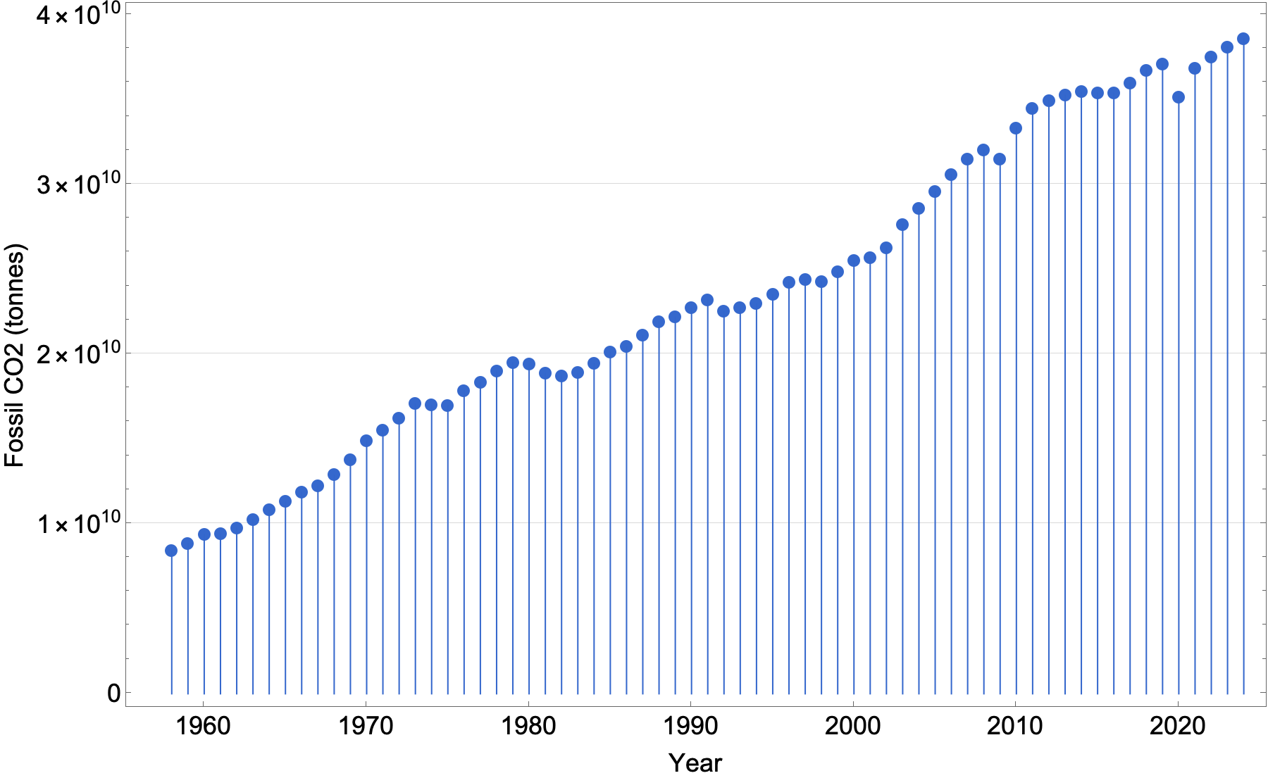
How to read it
This graph shows carbon dioxide emissions from fossil fuels and industrial processes only, measured in tonnes.
Apologies for the scientific notation, but space is tight in a graphic, and those zeroes are so fat. By way of clarity, emissions in 1958 were 8,417,516,500 tonnes. In 2024, they were 38,598,580,000 tonnes.
Limitations
Dataset: This is NOT the same as the graphs you may have seen of global carbon-dioxide equivalents (which include methane, nitrous oxide, and a host of other greenhouse gases). This is just the carbon dioxide emitted by fossil fuel use and industry (gas-plant flaring and cement manufacturing, for example). It does not include emissions from land use or forestry (including fires).
Timespan: You'll often see CO2 related charts that are centuries long. Here, we only go back as far as 1958, because that's as far back as the data source for the next graph goes. We wanted them to be easy to think about at the same time.
Measurement: While we can measure the amount of greenhouse gases in our atmosphere, we can't measure every bit of emission directly, so we apply different techniques to get a complete picture.
These numbers use a lot of "bottom-up" reporting: take a laboratory measurement of emissions from a device, allow for the performance of less-than-perfectly-maintained machinery, estimate the number of devices, and multiply it all out. Corporations self-report on emissions from devices they manufacture and activities they control. Think about a billion and a half automobiles on the road: almost none of them ever have their emissions directly measured, but we know how much fuel they consume (fuel sales) and how far they drive every year (insurance data), so we can make an estimate. In some instances — either through corporate will or controlling legislation — those estimates are pretty good. In other cases, they are perhaps not.
Interpretation
Carbon dioxide comes from many other sources, but just looking at fossil fuel and industrial emissions makes the environmental problem very very clear, especially when you consider the next graph at the same time.
Accumulated atmospheric CO2
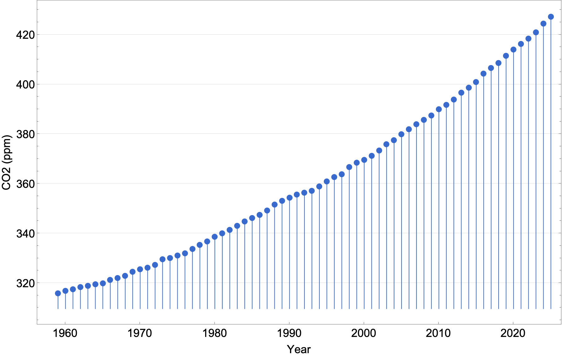
How to read it
This companion metric tracks only accumulated atmospheric carbon dioxide, measured in parts per million. In an atmosphere in balance (homeostasis), this graph would be more-or-less a flat line. But when more CO2 is emitted than is absorbed, the graph goes up. Once atmospheric carbon dioxide is in surplus, it can stay around in the atmosphere for many years ... or even millennia.4
Limitations
Data for this particular version of this graph is measured only at one site on a mountain in Hawai'i. It samples air from the Earth's lower layer (about the bottom 15 kilometres of air). The location and altitude of the observatory create good mixing, so local influences are negated, but it is mounted on a volcano, so researchers must allow for occasional local upslope emissions.
The chart begins in 1958 because that's the year the observatory started collecting data. It is the longest single direct-measurement record of carbon dioxide on Earth.
This graphic does not include measurement of other substances that produce greenhouse gas effects.
Interpretation
The bathtub is filling faster than it can drain.
The trend won't reverse itself until the amount of carbon dioxide released from all sources (human and otherwise) is less than the amount sequestered by the planet (and, perhaps, by engineered carbon sequestration technologies).
Post-script on units
You may wonder why the two graphs are in different units: tonnes and parts per million. They are roughly interchangeable (with a few caveats we don't need to go into here), so the graphs could use the same units. But the real, practical reason is that emissions are estimated in tonnes, often through self-reporting by corporations, because we want to know how much carbon dioxide is added. But to measure the result of those emissions, we want to know the atmospheric concentration: how many parts per million of total CO2 are in the air. No matter which units we use, the graphs would be more-or-less the same shape.
Reading
- Carney, Mark. “Carney: Climate Change an Opportunity for Financial Stability.” Arthur Burns Memorial Lecture, Berlin, September 22, 2016. Quoted in Deutsche Bundesbank. “Carney: Climate Change an Opportunity for Financial Stability.” Accessed February 27, 2026. https://www.bundesbank.de/en/tasks/topics/carney-climate-change-an-opportunity-for-financial-stability-667174.
- Ritchie, Hannah, Pablo Rosado, and Max Roser. “CO₂ and Greenhouse Gas Emissions.” Our World in Data, December 5, 2023. https://ourworldindata.org/co2-and-greenhouse-gas-emissions. Carbon dioxide comes from many other sources, but just looking at fossil fuels makes the problem very very clear.
- Team, GML Web. “Trends in CO2 - NOAA Global Monitoring Laboratory.” Accessed February 28, 2026. https://gml.noaa.gov/ccgg/trends/index.html.
- Inman, Mason. “Carbon Is Forever.” Nature Climate Change 1, no. 812 (2008): 156–58. https://doi.org/10.1038/climate.2008.122.)